Small Town
Bringing this small town’s playfulness, family-oriented values, and taste of adventure to your screen with this website redesign.

Duration
8 Weeks

Role
UI, UX, Animation, Branding

Team
Solo Project

Software
Figma, Adobe Illustrator
Overview
Narrowing in my sights on a small town website redesign, I turned to the town of Brookline, New Hampshire. How could the town’s heavy emphasis on community-building, their school district, and the outdoors be translated into their website?
The Problems
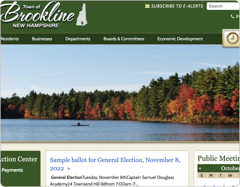
Lacks Personality
What does this say about the town? The website does not represent the young and thriving community within the town with its plain and generic layout and content.
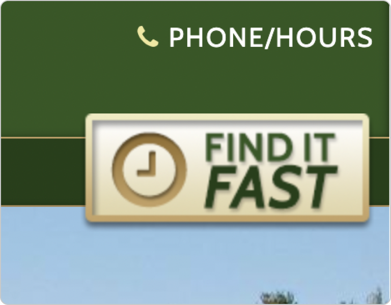
“Find It Fast” Is Slow
Find it fast... isn’t fast? The page doesn’t make it easy nor quick to find certain phrases or terms. This feature is also redundant with the search bar. The navigation needs to be more concise.
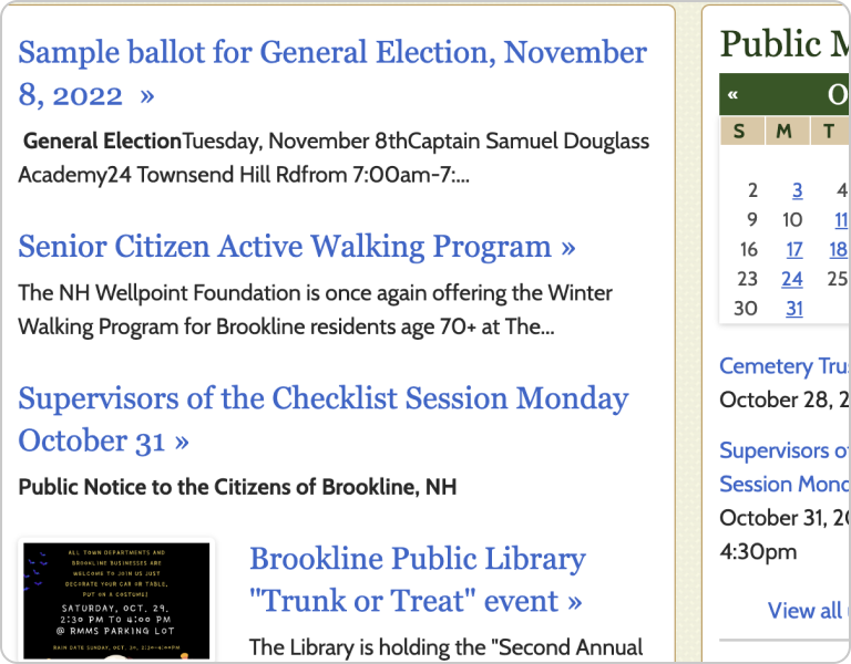
Outdated Content
The visual and written content as well as the layout does not show the recent activities or events of the town. It is hard to gauge what the community is like because nothing indicates the personality of the town.
Comparative Analysis
To figure out where to start, I conducted a comparative analysis of other town and city websites. I analyzed both government and tourist websites to create a more comprehensive approach while keeping the types of content currently on Brookline’s website.
Key Findings
Lacks Personality
What does this say about the town? The website does not represent the young and thriving community within the town with its plain and generic layout and content.
“Find It Fast” Is Slow
Find it fast... isn’t fast? The page doesn’t make it easy nor quick to find certain phrases or terms. This feature is also redundant with the search bar. The navigation needs to be more concise.
Outdated Content
The visual and written content as well as the layout does not show the recent activities or events of the town. It is hard to gauge what the community is like because nothing indicates the personality of the town.
User Flows
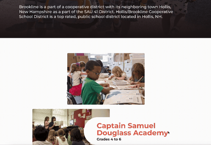
I analyzed user’s workflows on the website. With Brookline heavily emphasizing its school system and family-oriented communities, I prioritized this in the restructuring of the content.
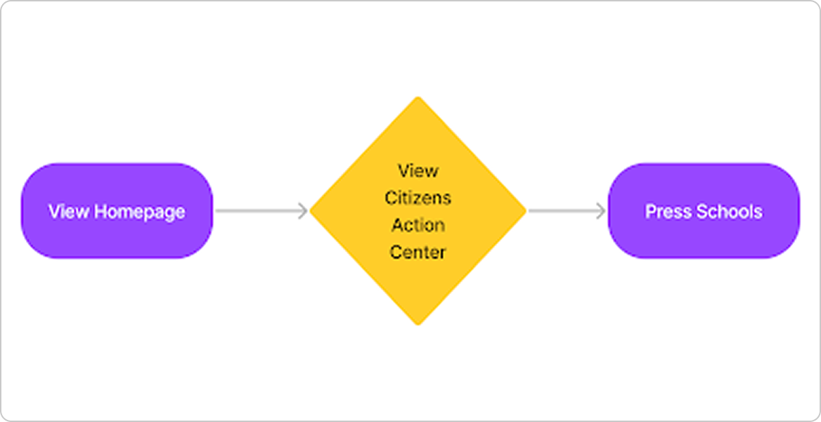
Original
Finding the schools for the town was buried in the Citizens Action Center. This page’s unclear title made it difficult to create an association between it and the school system.
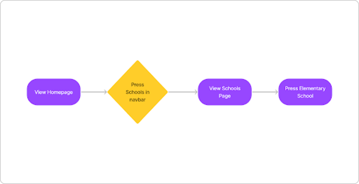
Updated
With the town being so focused on its school system, including a navigational item to directly access the information about the schools allows for a faster navigation to school-related content for new users.
Sketches
To expand on the user flows that I had created, I sketched out several iterations of how to organize each page. I explored incorporating common UI patterns identified through the comparative analysis, including quick links to high traffic pages.
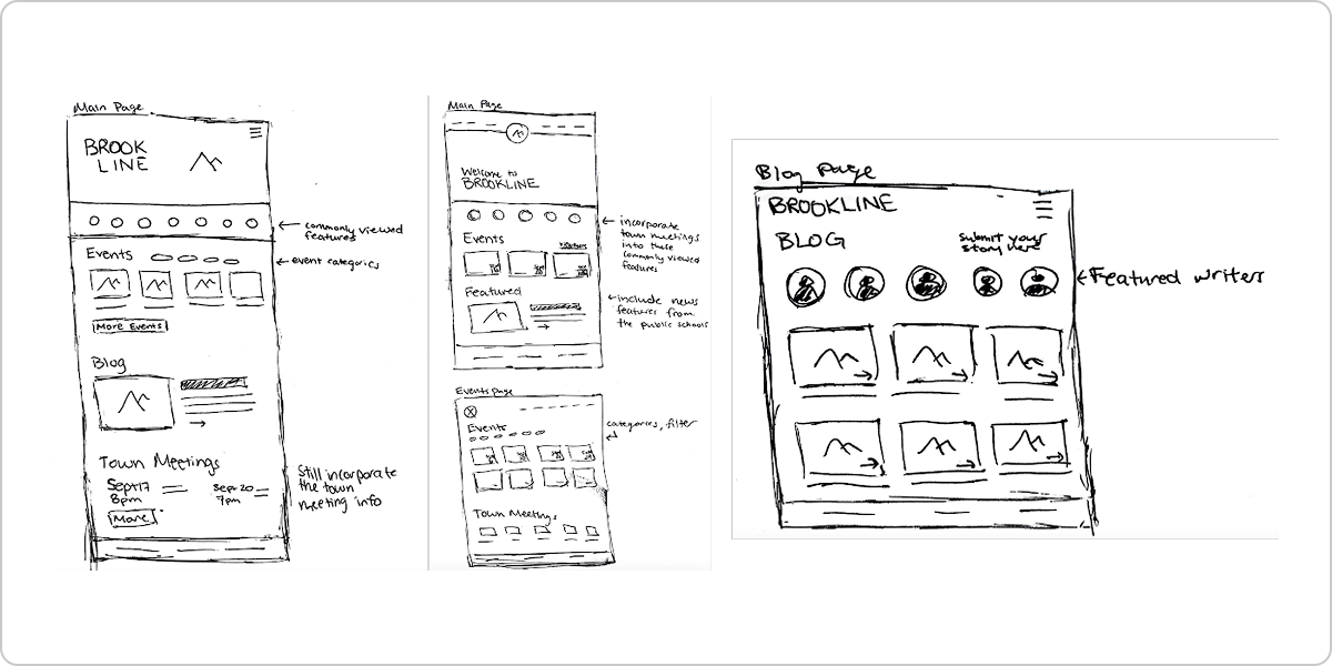
Iteration
As I began to digitize my sketches into wireframes, I continued to iterate on the low-fidelity wireframes. I refined the written content from the current website. These iterations eventually led to medium-fidelity wireframes with the beginning of explorations incorporating basic shapes and asymmetrical layouts.
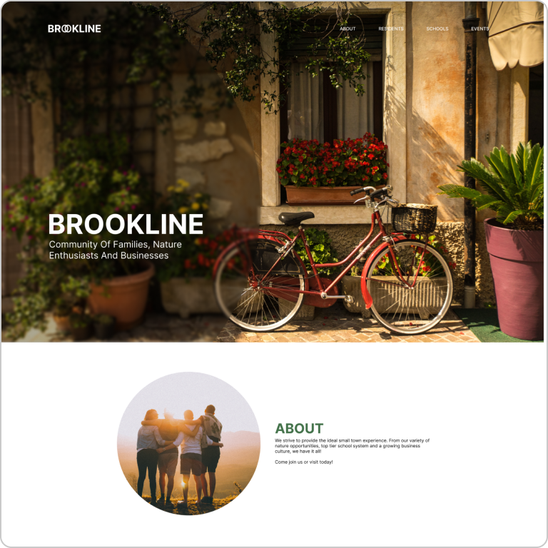
Home
An early exploration on providing quick links to key areas of information while highlighting the community through the tagline.
%201.png)
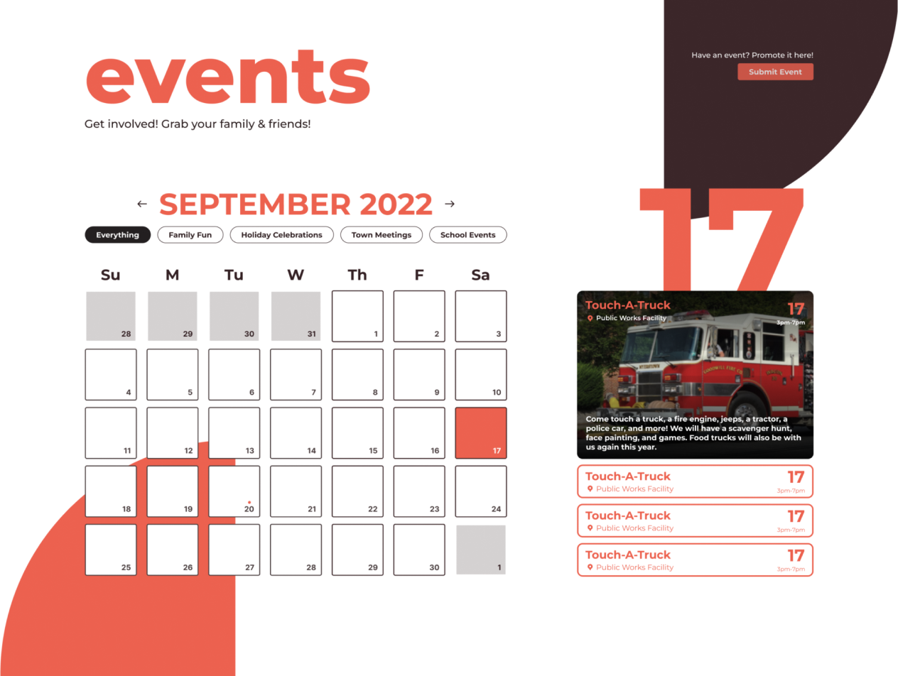
Events
A later exploration of a new page for events to create a one-stop-shop for all town and community events.
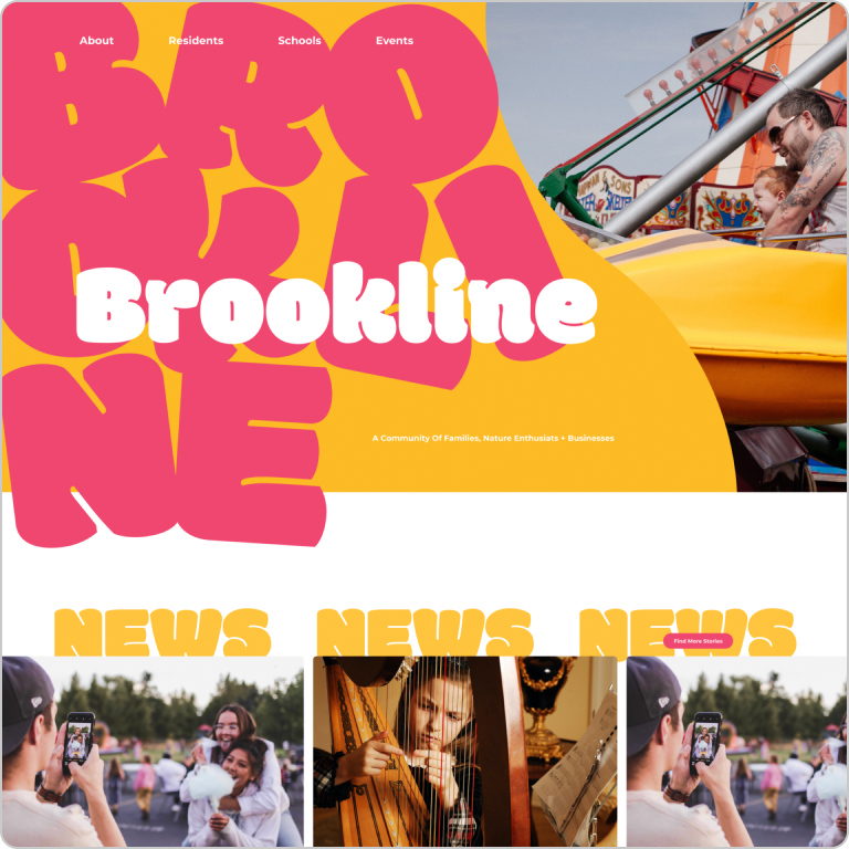
Visual Treatment
Based on the findings from the comparative analysis, I knew that I had to leave a bold and memorable impression that either catered towards fun and play to represent the large population of families or to lean into the heavy nature scene. I explored all of these directions to uncover which direction to go. Ultimately, I landed on “Asymmetric & Muted”. It highlights the fun and playfulness of a family-oriented community while also hinting at nature with its earthy brown color palette.
Asymmetric & Bright
Fun and playful visuals to highlight how kid-oriented the town is. This direction lost the representation of the nature and outdoorsy parts of the town.
Refined Outdoorsy
This direction was very tame and unmemorable. It didn't highlight the target audience of families, but leaned too heavily towards the nature scene.
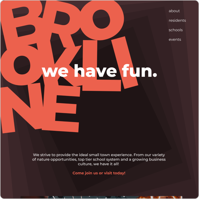
Asymmetric & Earthy
Earthy color palette with a pop of color for playfulness. The asymmetry is memorable and fun to represent families, while not leaning too childish through a less stylized font than Asymmetric & Bright.
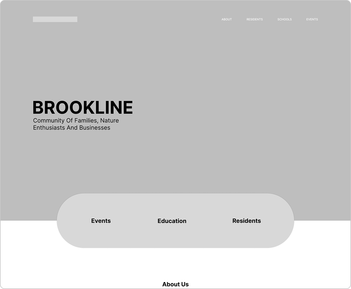
Finalizing Wireframes
After landing on the “Asymmetric & Earthy” design direction, I continued to build out the rest of the pages in this visual treatment. I considered different ways to convey a clear text and navigation hierarchy to improve on the navigation from the original website.
Micro-Animations
While working on the pages, I also explored different micro-animations to add character and incorporate fun further into the design.
Background Animation
Subtle movement of background shape to draw visual interest.
Scroll Animation
Movement to play with how the elements build as a user scrolls through the page and consumes information.
Outcome
After lots of exploration, the website redesign was completed. It included a clear visual identity that is representative of the town’s community and population, memorable interactions through micro-animations, and a clear hierarchy.
More Like This
Pizza Shop